Rendered in Marmoset Toolbag2
Thursday, 19 December 2013
1930's Kitchen
Rendered in Marmoset Toolbag2
Thursday, 12 September 2013
Friday, 26 July 2013
Boys Anti-Tank Rifle
I made this Boys Anti-tank rifle a while back, but it fell into the dreaded kingdom of WIP land...
Anyway, I rescued it, fixed some crap and re-rendered.I'm gonna make a low poly, textured version next.
Monday, 8 July 2013
Saturday, 3 November 2012
-Captain Mal Reynolds update-
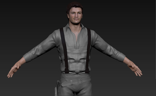
Decided to load this back up, thinking of doing a bigger project with him, purely fan-art.
Its not quite ready for low poly time, but a few fixes here and there should sort that out.
Anywho, anjoy
Saturday, 8 September 2012
Saturday, 16 June 2012
Fight Game Character - The Gent -
A character I've been working on in spare time [spare being the operative word, I've bagged a job 200 miles away, so I've been trying to arrange somewhere to live]
There are still a few things I need to work on: the diffuse and specular needs a quick tweak and there are a couple of areas the skin didn't take too well.
There are still a few things I need to work on: the diffuse and specular needs a quick tweak and there are a couple of areas the skin didn't take too well.
Here is the process from concept to it's current state.
 | |
| Finalised Zbrush Sculpt |
 |
| Low Poly: 3600 tri's |
 |
| Rigged [Biped] Skinned [3ds Max Skin] and Posed - Ready for animation |
Something to note: he's going be for an iOS game, but the only poly's on screen will be character, so a high poly count would be fine [something like 9k perhaps]. I managed to get it down to 3600 tri's and was satisfied with the silhouette and animat-ey topology. Watch this space for updates on "Fight Game" [name to be decided]
Thursday, 7 June 2012
Wednesday, 6 June 2012
Tuesday, 5 June 2012
Sunday, 3 June 2012
Tuesday, 8 May 2012
-The Pagemaster: Horror-
So, here's what i've been working on today. In case you're unaware of who he is, he's "Horror" from a 90's Film/Cartoony thing "The Pagemaster."
I'm planning on doing the other two books after this guy is finished.
Still plenty to work on, but the idea is there.
Horror:
I'm planning on doing the other two books after this guy is finished.
Still plenty to work on, but the idea is there.
Horror:
Wednesday, 2 May 2012
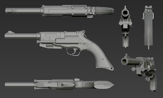
-Captain Mal Reynolds' Pistol-
Yay...GUN
Spent most of the day on this.. O_O...
Fancied something a little more technical than organic sculpting
For something that is gonna be on screen at about an inch of the display...maybe I could have made it less detailed...ah well, now he has a shiny gun..
Spent most of the day on this.. O_O...
Fancied something a little more technical than organic sculpting
For something that is gonna be on screen at about an inch of the display...maybe I could have made it less detailed...ah well, now he has a shiny gun..
有光澤!
Tuesday, 1 May 2012
-Nathan Fillion update-
So i've been working on my Nathan Fillion sculpt, getting the clothing bases on there etc. The braces were...unpleasant to make, but I think that'll be the most technical part of him.
Anyway...hopefully i'll keep this up to date and a progression should start showing. Cheers
Anyway...hopefully i'll keep this up to date and a progression should start showing. Cheers
Labels:
mal reynolds
TIME TO BLOG
Massive neglect to the blog as of late, so dumping some work. Ill put a bit of text explaining what and why they are here... boop!
| [Slig] Decided to do a bit of fan art, so here's a Slig from the 90's game Abes Odyssey. The organic bits were entirely zbrush, whereas the mechanical bits were 3DS MAX. |
| [Head 01] Testing out head sculpting abilities and realistic texture painting methods. Starting to understand it. Everything in Zbrush |
| [Head 02] Same as Head 01, head sculpting abilities and realistic texture painting methods. Everything in Zbrush |
| [Demony] Speed sculpt, attempting a full body anatomy study..with a cool head. Zbrush again |
Thursday, 6 October 2011
Monday, 3 October 2011
Thursday, 4 August 2011
Tuesday, 2 August 2011
Ive been determined to get back into zbrush for a while, so I decided to grab a mirror and do a self portrait. Been a bit difficult because i'm not bald, but I think it came out pretty decent. I did a VERY quick paintover in photoshop to satisfy my urgency to make it look like me, nothing major, just hair and eyes.
Then I caught the z-bug and found an awesome looking picture of a guy [no homo] on dat instanet, so I made him too. Also on my to-do list was texture painting from a photo, so here it is... Saturday, 4 June 2011
So, we had the glammies yesterday [an end of year showy thing], got to meet a couple guys from industry, which was cool, and also I won the category of "Best Cg Artist", apparently it was pretty close, but in the end won it for - in the words of the dude from Blitz Games - my "mundaine" assets XD
Liam Grice - 2010/11 Showreel from Liam Grice on Vimeo.
2011 Showreel, produced in the 3rd year of university.
Liam Grice
Now begging for work
email : liamgrice@gmail.com
blog : liamgrice.blogspot.com
website : liamgrice.webs.com
Liam Grice - 2010/11 Showreel from Liam Grice on Vimeo.
2011 Showreel, produced in the 3rd year of university.
Liam Grice
Now begging for work
email : liamgrice@gmail.com
blog : liamgrice.blogspot.com
website : liamgrice.webs.com
Friday, 27 May 2011
Thursday, 19 May 2011
Thursday, 28 April 2011
As well as the character, vehicle and asset/level bits, i'm responsible for the games frontend stuffs - the HUD, menu, labels, icons etc etc, to basically give it a higher level of professionalism, and make it feel like "our" game.
I had a play about with scaleform, built 3 menu systems that didnt work [they just didnt want to communicate with the udk at all] but in the end, found out how they transfer data between each other, thus these ^.
99% of the code work, however, goes to Dann, for making blank buttons actually do things [i managed to get it to load up our level when you hit start, but im completely out of my depth with anything else. Learned a hell of a lot from watching him sort it out though] In the video hes linked the character/vehicle selection buttons to actually select them and save them, so when you choose start, the game loads with whichever character/vehicle you have selected, neat.
The bottom lil bit is what ive been doing this morning, I can't even begin to think when the last time I vectored something was, good fun anyway. Its a basic template for the manual, in-game display of controls, and a lil poster we'll print for the end of year show.
It's nice to see everything coming together, never thought i'd be as chilled out as I am now, still a fair bit to do, but we nailed a lot very early on, so now its just a case of polishing everything. Cant wait for the exhibition.
Wednesday, 27 April 2011
For our business module, we are required to build a website, here is mine
Tried making it fancy, covered from top to tip in grunge, then decided against it. This showcases my work, and nothing else. I don't think potential employers really care what font my name is in, or if a dancing brick introduces my work, so I went for a simple, clean, "here is my work, look at it" approach.
Its not fully functional, but I'm working on a photoshop work flow to format my work automatically and upload it in a blink, it should be easy enough, however, I'll worry about that when my work is "good" enough to display, it would be a completely pointless exercise spending hours rendering/formatting/coding stuff that is not going to be used. Measure twice, cut once etc
anyway here's the earl:
www.liamgrice.webs.com
I also doubt ill be purchasing a host name any time soon, ".webs" is hardly an annoyance to type up/add to contact information etc, so I'm relatively satisfied as of this moment.
Cheers
Tuesday, 19 April 2011
Thursday, 7 April 2011
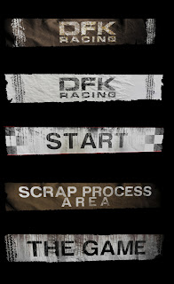
Spent yesterday vomiting assets, here are the results. Made a flag, with dynamic cloth, a Vegas style arrow sign, the bulbs turn on and off intermittently, and a banner, the texture page holds five different banners, so all that is needed for a different one is to move the uv's down [as demonstrated at the bottom]
I think from now on I'll try to post everything I can in the game engine viewer, seems nicer that way, much better representation of what it's to look like.
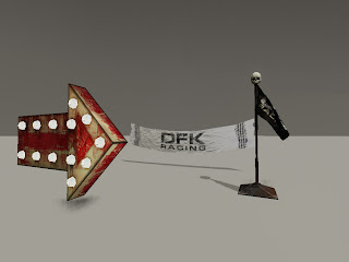
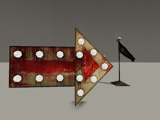
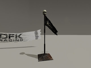
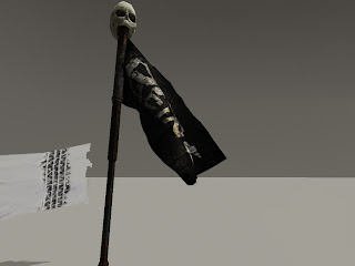
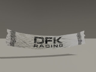
I think from now on I'll try to post everything I can in the game engine viewer, seems nicer that way, much better representation of what it's to look like.


Subscribe to:
Comments (Atom)


